New and Improved Charts and Reports Experience
Since our last major release of Charts & Reports for Jira Service Desk, now Jira Service Management, two years ago, we’ve been delivering feature requests that all of you have been asking month over month. With over 500 customers, VIEW26 Charts & Reports for Service Management has become one of the most popular Reporting tools for Jira Service Desk Management. We’re in the process of giving Charts & Reports for Service Management a major facelift, and today we are providing you a look at the new V3 features!
The primary motivation behind this new version was moving our front-end stack from Angularjs to React. Moving the stack to React has helped us solve the design inconsistency with respect to Atlassian Design principles and bring more harmony by using Atlas-kit components along with our custom React components.
What’s changed in V3?
So what’s changed in Version 3.0? Besides the stack, a few other things you’ll notice in this release are:
🔐 Edit permissions for shared Reports: You asked for it, and we delivered it! This was one of the most requested features by our users, and we finally have it here!
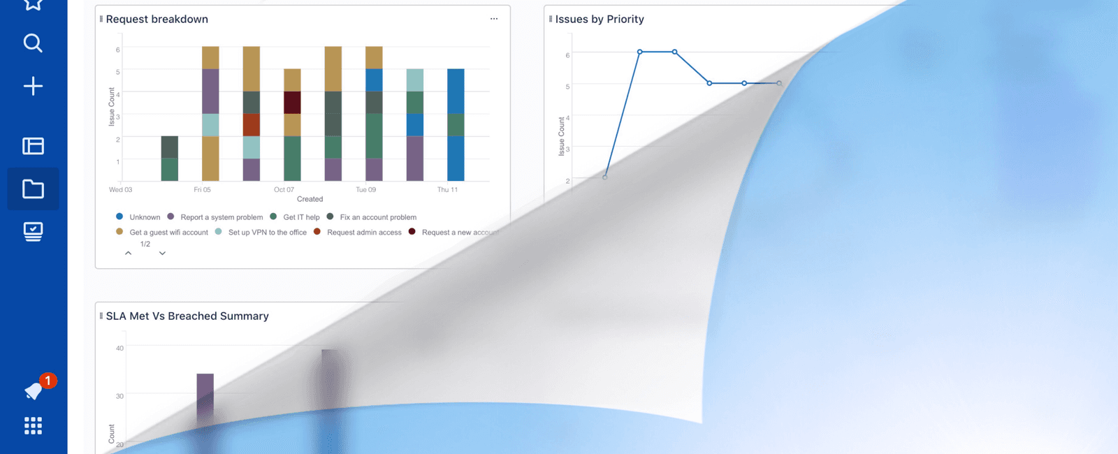
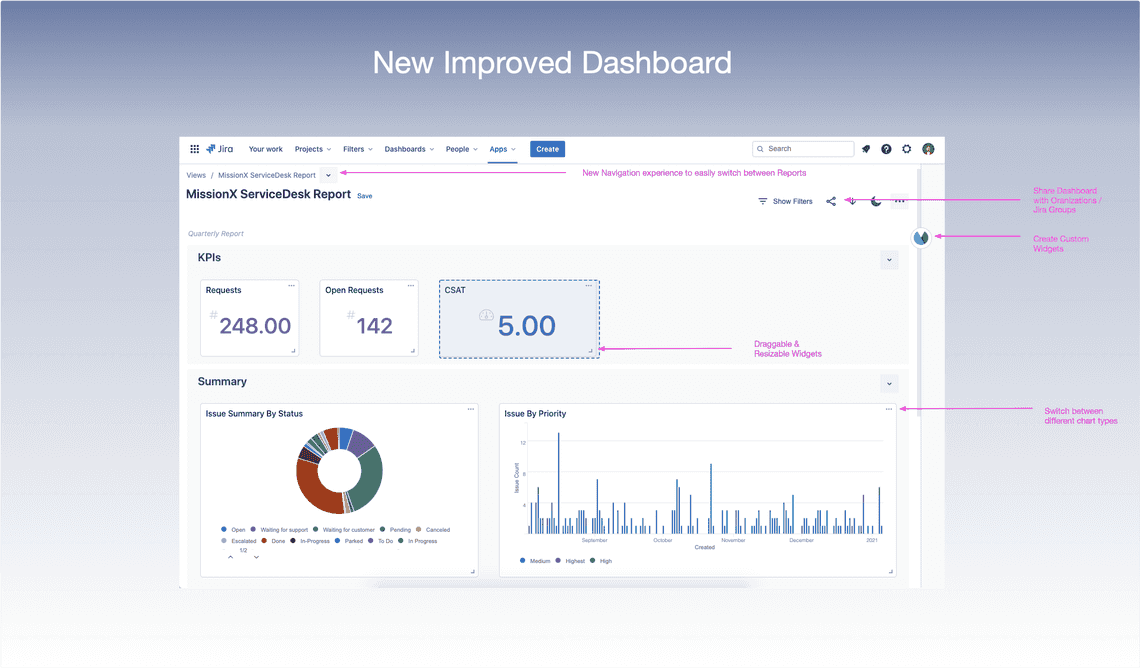
📊 Improved Dashboard experience With the new, improved dashboard, users can easily resize and rearrange charts & widgets.
📎 New Navigation experience We have revamped the navigation experience for the App to allow easy switching between different VIEWS and navigating to the Home/Widgets Settings page.
🔑 Hardened Security The app is now part of Atlassian’s Bug Bounty program to ensure that any vulnerabilities are caught by independent security researchers.
👀 Better UX integration with Atlassian Design principles by using Atlas-kit components.
🌉 Support for Dark mode With just a click of a button, save energy, and enhance readability by reducing eye strain in low light conditions.
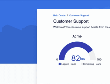
📈 Full-screen report view in Customer Portal…
And that’s not all… A lot of minor enhancements on the UX side.
With each new release, we are persistently striving to bring out the best to our users and improve their experience. The new and improved Charts and Reports for Jira Service Management is a compelling and flexible reporting solution at the Service Desk Management level, allowing customers to customize and craft Dashboards across different Jira Projects easily. Reports are made even more accessible with the new user experience and shared with customers via the customer portal!
Try it for yourself at the Atlassian Marketplace for free! ✨
Comment below to let us know your thoughts and reviews about this new upgrade. We would love to hear from you all!
Here’s wishing a happy and healthy 2021 for you and yours!
Marketing Manager - VIEW26
PRODUCTS


